


A design language is the shared set of visual and behavioral rules that shape how a product looks, feels, and responds to the people who use it. It brings together color, typography, iconography, spacing, motion, and interaction patterns into one coherent visual system that a brand can repeat across every screen, app, and touchpoint. Understanding this system is the first step toward building digital products that feel intentional rather than accidental.
Throughout this guide, we will unpack what a design language actually means, why it matters, who builds it, and how you can create your own from scratch. We will also look at real examples, the words designers use to describe one, and how the concept stretches beyond software into art and architecture.
What Is a Design Language?
At its simplest, a design language is a structured vocabulary of visual and interactive elements that a team uses to communicate with the people using their product. It defines how colors, type, icons, imagery, spacing, and motion work together so that every screen feels like it belongs to the same family. This visual vocabulary is less about a single screen and more about the underlying grammar that every screen follows.
This grammar acts as a bridge between early sketches and a finished interface. It gives a brand a recognizable fingerprint, letting users identify a product by its look and feel even before they see the logo. A mature system captures not just what things look like, but why those choices were made in the first place.
Why Do You Need a Design Language?
A design language keeps a project moving forward with clarity and speed, because teams stop reinventing basic decisions on every new screen. Instead of debating button shapes or spacing values from scratch each time, designers pull from an established playbook. This alone can shave weeks off a product timeline.
Beyond speed, a strong visual system builds trust. When colors, type, and interaction patterns stay consistent, users feel like they are dealing with one coherent brand rather than a patchwork of disconnected screens. That familiarity reduces the learning curve, increases confidence, and ultimately drives loyalty toward the product.
Benefits of a Well Built Design Language
A carefully considered design language pays off in several concrete ways for a business and its design team. Some of the most common advantages include:
- Consistent output across teams, regardless of who is working on a given feature
- Faster onboarding for new designers and developers, since the rules are already written down
- Stronger brand recall built through repeated color, type, and shape choices
- Lower design costs, since fewer decisions need to be remade from scratch
- Better usability, because familiar patterns reduce the mental effort needed to use a product
- Easier scaling, since new features can borrow existing components instead of starting over
Each of these benefits compounds over time. A team that documents its visual system early tends to spend far less time firefighting inconsistency later, and that discipline becomes a genuine competitive advantage as the product grows.
Components of a Design Language
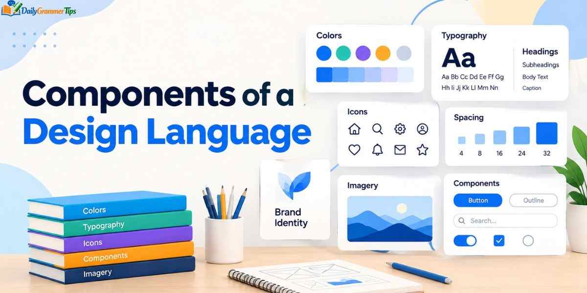
Every design language rests on a handful of building blocks that work together rather than in isolation. Typography sets the tone and readability of the product, using scalable type sizes and weights to build a clear hierarchy between headings, subheadings, and body copy. Color does similar work on an emotional level, with primary, secondary, and accent hues chosen to reflect the brand while staying accessible to users with visual impairments.
Iconography, imagery, shapes, and motion round out the visual side of the system. Icons act as visual shortcuts that reduce reliance on text, while photography and illustration guidelines keep imagery consistent in tone and treatment. Interactive elements such as buttons, toggles, and sliders, along with their hover and focus states, complete the picture by defining not just how the product looks but how it behaves when someone touches it.
Design Language vs Design System
People frequently use these two terms interchangeably, but they describe different layers of the same process. A design language is the philosophy and the visual vocabulary, while a design system is the practical toolkit built to deliver that vocabulary at scale.
| Aspect | Design Language | Design System |
| Definition | The visual and behavioral principles that define look and feel | The reusable components and documentation that implement those principles |
| Focus | Colors, typography, tone, imagery, interaction philosophy | Component libraries, code snippets, style guides |
| Purpose | Shapes how a brand should feel to users | Shows teams exactly how to build that feeling |
| Ownership | Designers, brand strategists, researchers | Designers and front-end developers working together |
| Output | A conceptual foundation | A practical, testable toolkit |
Thinking of the visual language as the soul of a product and the design system as its body captures the relationship well. One defines intent, the other delivers it consistently across every platform the brand touches.
Who Should Create a Design Language?
Building a design language is rarely a solo effort, and the strongest ones come from cross-functional collaboration. UX and UI designers usually lead the visual direction, shaping color, type, and layout decisions. Accessibility specialists check that every choice still works for users with disabilities, while UX writers and content strategists define tone of voice and messaging boundaries.
Researchers add another critical layer by translating real user needs into design decisions instead of guesswork. Front-end developers round out the group, since they are the ones who eventually translate the visual system into working code, and their input ensures the framework stays technically realistic rather than purely aspirational.
Learn more…………Quantum Computing: A Complete Guide to the Technology Reshaping the Future
How to Create a Design Language
Building a design language from the ground up follows a fairly consistent pattern across most design teams, even if the exact steps vary slightly by organization.
Start with a UI audit of everything that already exists, cataloguing fonts, colors, icons, and spacing across the product. This audit exposes inconsistencies and gives the team a factual starting point instead of relying on opinion. From there, teams typically move into research, studying the target audience, competitors, and market trends to understand what the product needs to communicate.
Next comes the vocabulary stage, where teams name and define every visual element, from type scales to color roles to icon styles. Design principles follow, translating brand values like simplicity or boldness into concrete rules that every future decision can be measured against. Finally, teams build a component library and style guide, document everything clearly, and roll the system out gradually, starting with the highest traffic screens before working through the rest of the product.
Best Practices for Developing and Using a Design Language
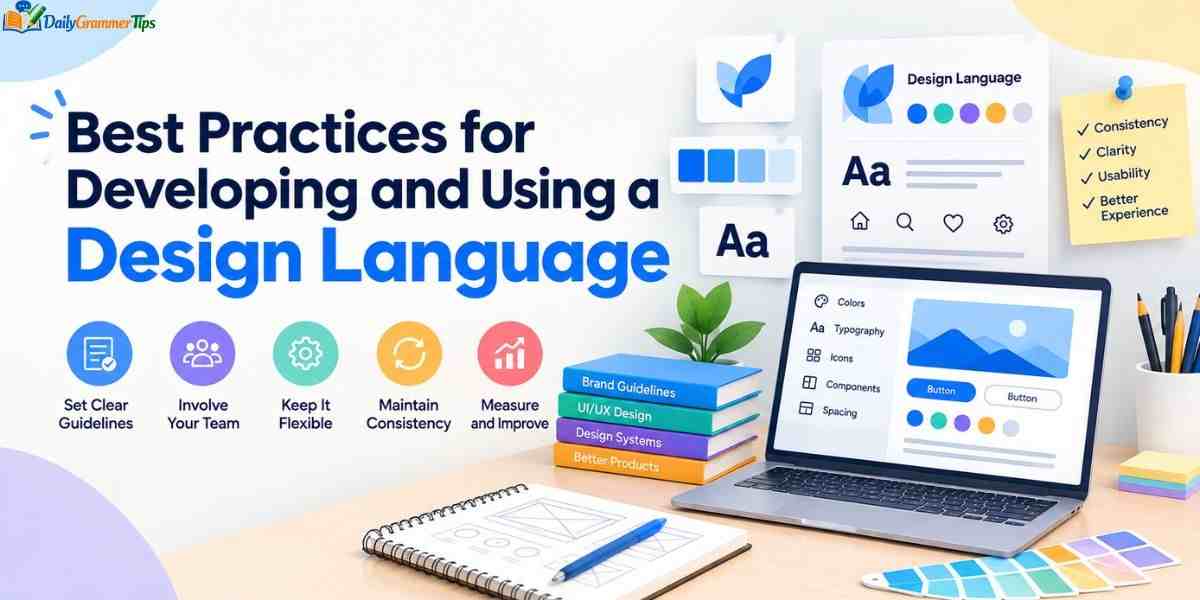
A design language stays useful only if it is treated as a living resource rather than a static document. Teams that succeed tend to research thoroughly before designing anything, studying both their own users and their competitors to spot real opportunities for differentiation.
Testing for accessibility should happen throughout the process, not as an afterthought, checking contrast ratios, screen reader compatibility, and keyboard navigation at every stage. Just as important is regular iteration. User needs shift, platforms change, and a visual system that never gets revisited will eventually feel dated even if the underlying product is still strong.
Design Language Examples
Some of the most recognizable brands in the world owe their consistency to a carefully documented design language. IBM is a frequently cited example, built around precise grid systems, consistent shapes, and a distinct illustration style that makes IBM products identifiable without needing to see the logo.
Apple offers a different kind of example, one built less around a single visual signature and more around fluid animation, minimal ornamentation, and intuitive interaction patterns repeated across every device. Duolingo takes yet another approach, leaning into a bright green palette, a friendly mascot, and playful iconography that makes its system instantly memorable even to people who have never used the app. Airbnb rounds out the list with a visual language built specifically for speed and scale, allowing the company to grow quickly without losing its brand identity along the way.
Graphic Design Language
In graphic design specifically, the term design language refers to the visual toolkit used across print, packaging, and digital marketing materials rather than software interfaces alone. This includes consistent use of color palettes, grid systems, imagery style, and typographic hierarchy across posters, packaging, social assets, and advertising.
A strong graphic design language ensures that a flyer, a billboard, and an Instagram post all feel like they came from the same studio, even when different designers worked on each piece. The goal remains identical to digital product work: recognizable, repeatable choices that reinforce brand identity every time someone encounters the material.
Design Language Words
Certain terms come up again and again when people discuss a design language, and understanding them helps teams communicate more precisely. Words like consistency, hierarchy, visual vocabulary, brand identity, style guide, component library, and design tokens all describe pieces of the same larger system.
Other frequently used terms include tone of voice, grid, whitespace, affordance, and pattern library. Learning this shared vocabulary matters because it lets designers, developers, and stakeholders discuss decisions using the same reference points, cutting down on miscommunication during handoffs and reviews.
Design Language List
A practical checklist helps teams confirm they have covered the essential pieces of a design language before calling it complete:
- Color palette, including primary, secondary, and accent colors
- Typography scale for headings, subheadings, and body text
- Iconography style, stroke weight, and sizing rules
- Imagery and illustration guidelines
- Spacing and grid system
- Interactive states for buttons, links, and form fields
- Motion and animation principles
- Tone of voice and content guidelines
Treating this as a working checklist, rather than a one-time exercise, keeps the system accurate as a product evolves and new components get added over time.
Design Language in Art
Outside of software, the phrase design language also applies to fine art and visual culture, where it describes the recurring shapes, colors, and motifs an artist or movement returns to again and again. A painter’s consistent use of brushwork, palette, and composition forms a personal visual language just as much as a tech company’s color system does.
Art movements like Bauhaus or Art Deco each carried their own design language, built from shared geometric shapes, material choices, and compositional rules that distinguished the movement from what came before it. This broader use of the term reminds us that the underlying idea, repeatable visual choices that create recognition, predates modern digital products by decades.
Design Language Architecture
Architecture offers one of the oldest applications of a design language, long before the phrase became common in software circles. An architect’s visual system might include consistent use of certain materials, structural forms, window shapes, or proportions that appear across an entire body of work.
Modernist architecture, for example, developed its own design language built around clean lines, functional forms, and minimal ornamentation, principles that later influenced digital design work in noticeable ways. Recognizing this shared history helps explain why so much of today’s design vocabulary, including grid systems and modular components, borrows directly from architectural thinking.
Design Language IBM
IBM remains one of the most studied examples of a mature design language in the technology industry. Its system is built around a precise 2x grid, a distinct typeface family, and a carefully controlled color and iconography system that together create instantly recognizable products.
What makes the IBM approach notable is how deliberately every element ties back to a documented philosophy. Shapes, angles, and radii are engineered rather than chosen casually, which is part of why IBM products feel unmistakably consistent across such a wide range of tools, platforms, and business units.
Design Language Book

For teams wanting to go deeper, several published resources explore design language and design systems in detail, covering everything from typography theory to component architecture. Books focused on design systems thinking often dedicate entire chapters to defining visual vocabulary, documenting principles, and building scalable component libraries.
These resources are especially useful for teams building a visual system for the first time, since they translate abstract theory into concrete frameworks and examples that can be adapted to almost any product or industry. Pairing a good book with real audits of your own product tends to produce far better results than theory alone.
Frequently Asked Questions
What is meant by design language?
It refers to the shared set of visual and interaction rules, including color, typography, and iconography, that define how a product looks and behaves consistently.
What is the best design language?
There is no single best option, since the right visual system depends on a brand’s identity, audience, and goals, though IBM and Apple are widely studied examples.
What are the 7 steps of design?
Common frameworks include research, defining principles, creating a vocabulary, auditing the UI, building a component library, testing, and iterating based on feedback.
What is the language of design?
It is the combination of color, typography, shape, imagery, and interaction patterns that designers use to communicate meaning and emotion to users.
What are the different types of design languages?
Types include digital product visual systems, graphic design language for print and branding, and broader visual languages found in art and architecture.
Conclusion
A design language is what turns a scattered set of screens into a single, recognizable brand experience. When color, typography, iconography, and interaction patterns follow one consistent set of rules, users trust a product faster and teams build it faster too. The strongest examples, from IBM to Apple to Duolingo, all share this same discipline behind the scenes.
Building your own visual system takes research, collaboration, and ongoing iteration, but the payoff is a product that feels intentional at every touchpoint. Start small, document what you learn, and treat your design language as a living system rather than a one-time project, and consistency will follow naturally.
